Why Fonts Matter
In the bustling marketplace of brands, each brand is like a unique character in a grand, captivating novel, and fonts? They are the silent tone, the subtle accent that gives your brand’s voice a distinct personality. Let’s embark on a whimsical journey to explore why fonts are not just letters on a screen but a crucial element that can make or break your brand’s impression.
Fonts: The Unsung Heroes
Imagine fonts where actors. Each one brings a different vibe, emotion, and expression to the stage. A well-chosen font can convey trust, excitement, elegance, or whimsy, while a misplaced font can turn a drama into a comedy, or a love letter into a casual note.
For instance, the classic Times New Roman speaks with a formal, authoritative tone.
It’s like the Morgan Freeman of fonts - dignified and reliable, but even though it is a classic is it now seen as dated if used in a brand (unless the brand wants that old world I have been around for ages feel.
On the other hand, Comic Sans, the infamous, is like the class clown, informal and playful, often not taken seriously.

Setting the Mood with Fonts
Fonts have the magical power to set the mood. A luxury brand might opt for a sleek, minimalist font that whispers elegance and exclusivity, like the slender and refined Didot



In contrast, a brand that’s all about fun and creativity might go for something bold and quirky, like the rounded and friendly Baloo.

Take the iconic Disney logo. Its whimsical, playful font encapsulates the brand’s core essence of imagination and magic, instantly whisking you away to a realm where the impossible becomes possible.



JOIN THE WAITLIST: Heartbeats & Business Beats
Dive into the world of branding with 'Heartbeats to Business Beats.' Discover the art of harmonizing passion with strategy to create a brand that resonates and thrives.
Join the Waitlist Today and Set the Beat for Your Brand's Success.
Fonts and Brand Consistency
Brand consistency is akin to a harmonious symphony, and fonts are the instrumentalists. The font used in your logo crafts the initial impression, setting the stage. However, using this font everywhere can be overwhelming and counterproductive, like Disney using their logo font for all content—it would be overpowering and lose its charm.
Instead, brands should have a primary font and secondary, complementary fonts for different contexts. The primary font is your brand’s signature voice, while the secondary fonts are the supporting vocalists, providing variety and contrast while still harmonizing with the main voice. This approach crafts a coherent, engaging brand narrative without being monotonous or overwhelming.
For instance, while Disney’s logo font is magical and whimsical, the content on their websites and marketing materials often uses more readable, complementary fonts. These secondary fonts support the brand’s voice without overshadowing it, creating a balanced, engaging brand symphony.
Ways you could be consistent with your brand fonts is using the same one over


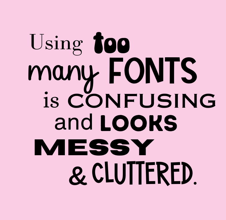
So, tread carefully beyond this point, as too many fonts can lead to a chaotic, disjointed appearance, disrupting the brand's flow and consistency.
The primary font is the lead vocalist, setting the tone and style for your brand's communication. This font should encapsulate the essence of your brand, be easily readable, and versatile enough for various applications, from logos to headlines.
Secondary fonts should harmoniously support and complement the primary font, providing variety without straying from the brand's overall style and feel. Think of these as the backup singers, enhancing the melody without overshadowing the lead.
If your brand has a signature font, use it sparingly for maximum impact. This font is the showstopper, the dazzling solo that captivates the audience, but using it too frequently can dilute its power and allure. Reserve it for special occasions, like logos or taglines, where it can truly shine without overwhelming the audience.
Navigating the world of fonts might seem daunting, but with careful selection and thoughtful application, these silent heroes can significantly enhance your brand's appeal and communication. So, choose wisely, and let your brand's unique voice sing through the captivating symphony of fonts
Avoiding Font Faux Pas
Choosing the wrong font is akin to wearing a formal suit to a beach party - awkward and misplaced. For example, using the playful Comic Sans for a legal document or a corporate announcement? A definite no-no. It’s crucial to understand the personality of each font and where it fits in the grand tapestry of your brand’s narrative.
Avoiding Font Faux Pas
Choosing the wrong font is akin to wearing a formal suit to a beach party - awkward and misplaced. For example, using the playful Comic Sans for a legal document or a corporate announcement? A definite no-no. It’s crucial to understand the personality of each font and where it fits in the grand tapestry of your brand’s narrative.
The right font in the right place is vitally important, and as we said before, using only two fonts and a signature font is ideal.
Fonts are the silent maestros conducting the symphony of your brand’s voice. They set the tone, evoke emotions, and play a pivotal role in crafting your brand’s unique personality. So, next time you pick a font, remember you’re not just choosing letters; you’re selecting a voice, a tone, a mood that will whisper, sing, or shout to your audience in myriad, subtle ways.
So, dive deep into the fascinating world of fonts, explore their personalities, and choose the one that sings in harmony with your brand’s voice. Let the silent, powerful symphony of fonts begin!
Heartbeats of a Brand
Harmonizing Passion & Strategy
Let's dive deep into the heart of brand-building. Discover the secret dance between passion and strategy and unlock the potential for exponential business growth.
